Design Analytics with GA4
UX and Data Research Project for Designer Training
To help Synology designers understand user interaction, I created a GA4 tutorial focused on scroll depth, click tracking, and engagement. The project bridges design intuition with data, enabling confident, data-driven UX decisions.
To help Synology designers understand user interaction, I created a GA4 tutorial focused on scroll depth, click tracking, and engagement. The project bridges design intuition with data, enabling confident, data-driven UX decisions.
Client / Industry
Synology / Software
Linda's Role
Project Manager
Skills
Data analytics
Date
June 2025
As a design coordinator, I often saw designers struggle to evaluate whether their work truly made an impact. Visuals looked great, but we lacked numbers to back our decisions. That’s why I created this GA4 tutorial—to bridge the gap between design and data, and help our team turn observations into insights.
As a design coordinator, I often saw designers struggle to evaluate whether their work truly made an impact. Visuals looked great, but we lacked numbers to back our decisions. That’s why I created this GA4 tutorial—to bridge the gap between design and data, and help our team turn observations into insights.
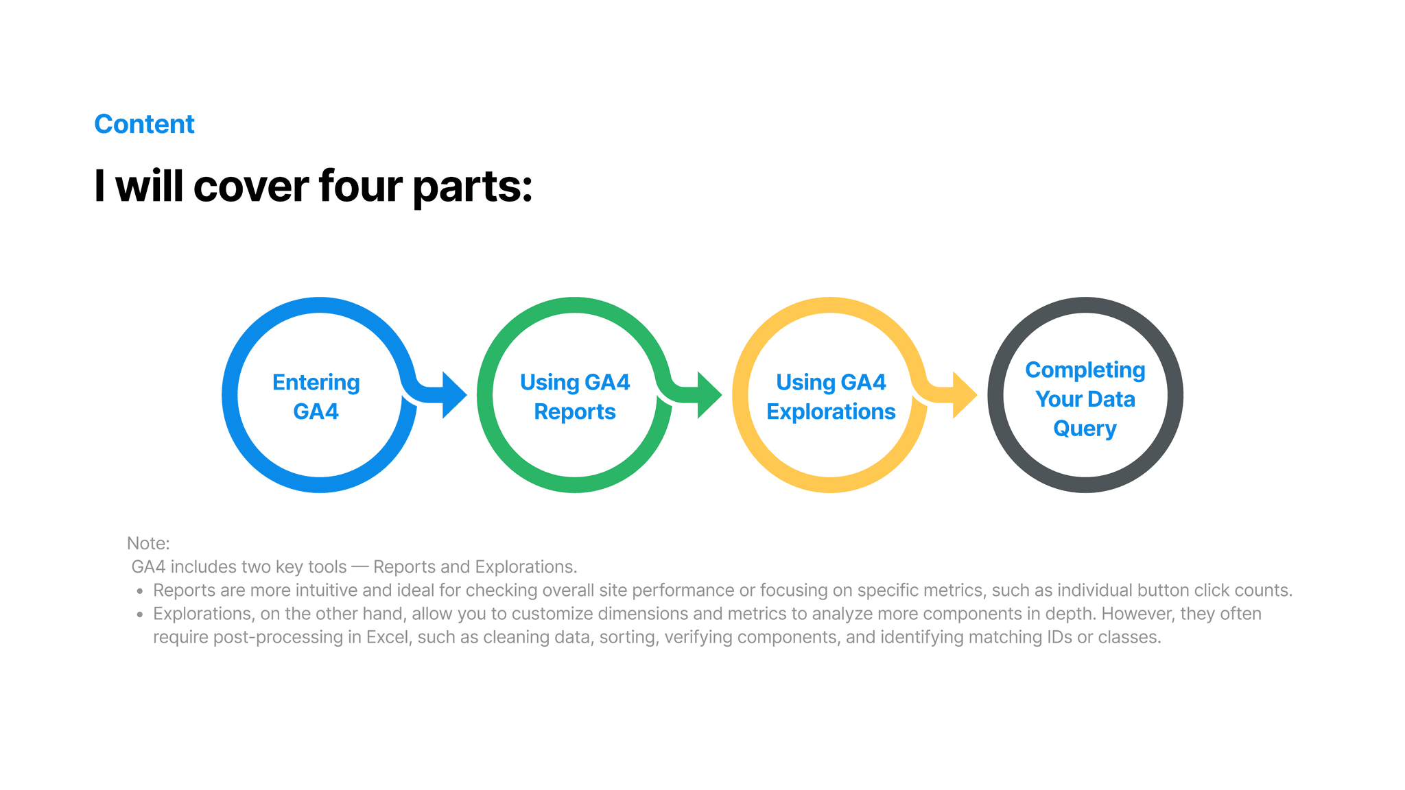
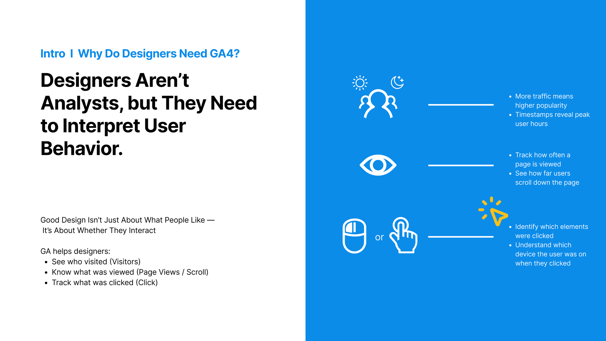
01. Introduction to GA4 – Why Designers Need It “Designers aren’t analysts, but understanding how users interact with our designs is essential." In this section, I introduce GA4—Google’s event-based analytics platform. Unlike traditional tools that only count pageviews, GA4 tracks actions like scrolls, clicks, and even video plays. These event-based metrics are more aligned with how we evaluate UX, and that’s why GA4 is so valuable to us as designers.
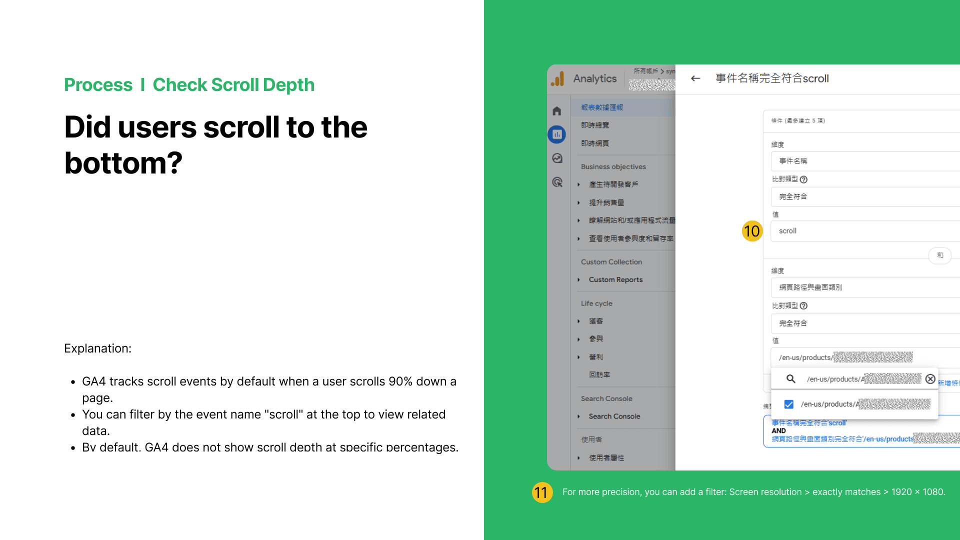
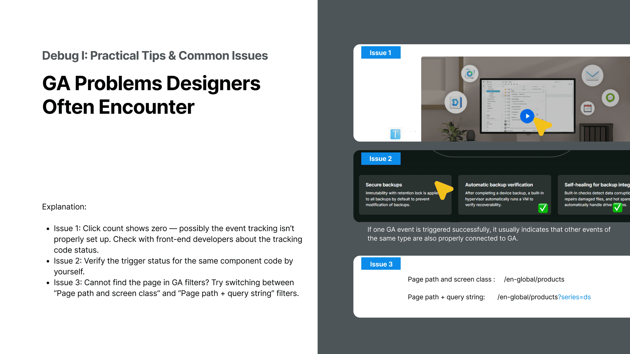
04. Debug & Insights – Turning Data into Design Decisions In the final section, I address common GA4 problems designers face—like why some clicks aren’t tracked, or why scroll rates look low. I teach how to debug these issues by checking event triggers or comparing ‘page path’ vs. ‘page path + query’. Then, we interpret the results: maybe users are dropping off halfway, or maybe buttons are underperforming due to placement. This stage turns raw numbers into design decisions, like reordering sections or adjusting layout to boost clarity and interaction.
04. Debug & Insights – Turning Data into Design Decisions In the final section, I address common GA4 problems designers face—like why some clicks aren’t tracked, or why scroll rates look low. I teach how to debug these issues by checking event triggers or comparing ‘page path’ vs. ‘page path + query’. Then, we interpret the results: maybe users are dropping off halfway, or maybe buttons are underperforming due to placement. This stage turns raw numbers into design decisions, like reordering sections or adjusting layout to boost clarity and interaction.

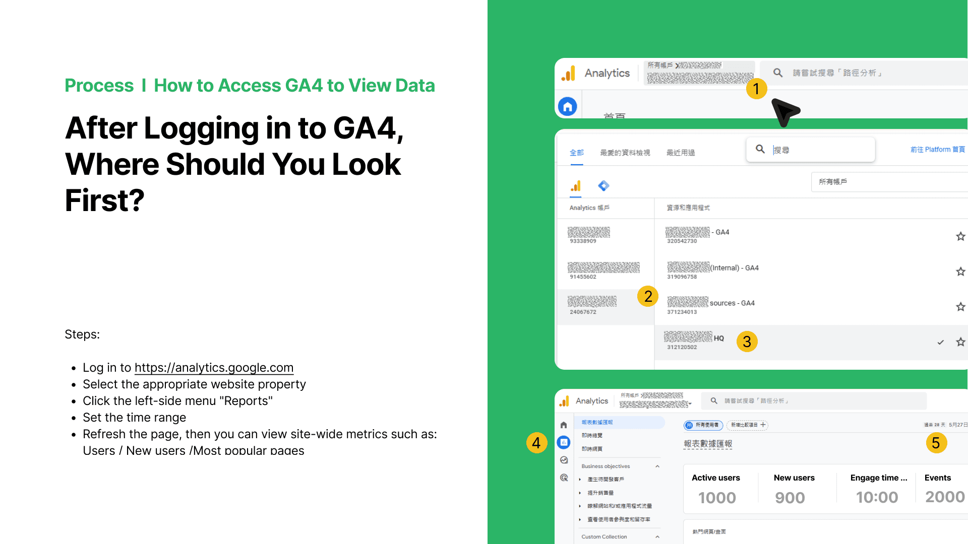
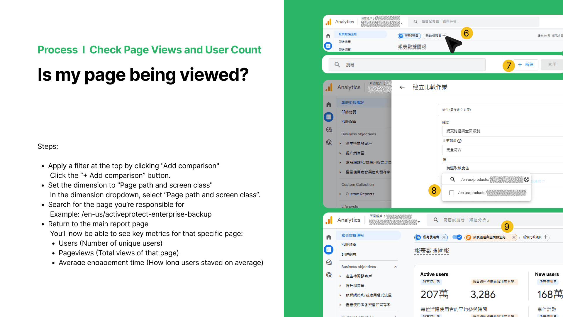
02. Using GA4 Reports – The Fastest Way to Find Page Data The ‘Reports’ tab is where most designers should start. It gives a quick overview of site performance—like how many users visited, which pages are most popular, and average time spent. I walk through how to filter reports by URL, so a designer can see data for just the page they’re responsible for. With no coding required, this helps designers answer questions like: Is my landing page being seen? Are users staying long enough to read the content?
01. Introduction to GA4 – Why Designers Need It “Designers aren’t analysts, but understanding how users interact with our designs is essential." In this section, I introduce GA4—Google’s event-based analytics platform. Unlike traditional tools that only count pageviews, GA4 tracks actions like scrolls, clicks, and even video plays. These event-based metrics are more aligned with how we evaluate UX, and that’s why GA4 is so valuable to us as designers.
01. Introduction to GA4 – Why Designers Need It “Designers aren’t analysts, but understanding how users interact with our designs is essential." In this section, I introduce GA4—Google’s event-based analytics platform. Unlike traditional tools that only count pageviews, GA4 tracks actions like scrolls, clicks, and even video plays. These event-based metrics are more aligned with how we evaluate UX, and that’s why GA4 is so valuable to us as designers.

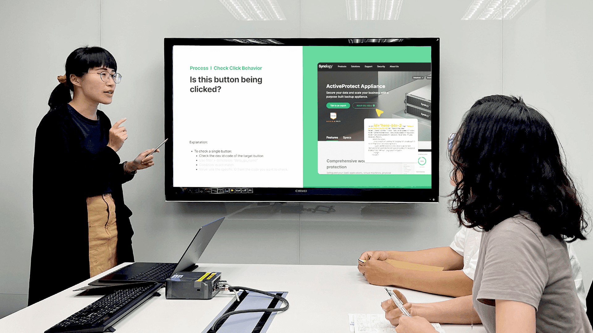
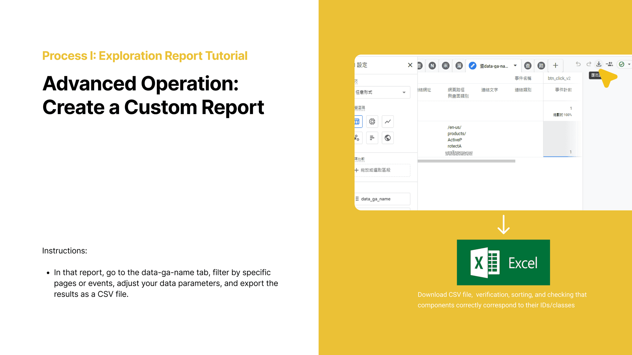
03. Using GA4 Explorations – Custom Reports for Deeper Insights “When basic reports aren’t enough, GA4’s ‘Explorations’ feature allows for deeper analysis. Here, I show how to create a custom report filtered by page path and button ID, to check very specific behaviors. We also export that data to Excel for tasks like checking scroll rates, matching event IDs, or comparing segments. This lets designers see things like: Which banner gets more clicks? Do people scroll further on Product A or B? These are powerful answers that shape real UX decisions.
02. Using GA4 Reports – The Fastest Way to Find Page Data The ‘Reports’ tab is where most designers should start. It gives a quick overview of site performance—like how many users visited, which pages are most popular, and average time spent. I walk through how to filter reports by URL, so a designer can see data for just the page they’re responsible for. With no coding required, this helps designers answer questions like: Is my landing page being seen? Are users staying long enough to read the content?
02. Using GA4 Reports – The Fastest Way to Find Page Data The ‘Reports’ tab is where most designers should start. It gives a quick overview of site performance—like how many users visited, which pages are most popular, and average time spent. I walk through how to filter reports by URL, so a designer can see data for just the page they’re responsible for. With no coding required, this helps designers answer questions like: Is my landing page being seen? Are users staying long enough to read the content?
04. Debug & Insights – Turning Data into Design Decisions In the final section, I address common GA4 problems designers face—like why some clicks aren’t tracked, or why scroll rates look low. I teach how to debug these issues by checking event triggers or comparing ‘page path’ vs. ‘page path + query’. Then, we interpret the results: maybe users are dropping off halfway, or maybe buttons are underperforming due to placement. This stage turns raw numbers into design decisions, like reordering sections or adjusting layout to boost clarity and interaction.
03. Using GA4 Explorations – Custom Reports for Deeper Insights “When basic reports aren’t enough, GA4’s ‘Explorations’ feature allows for deeper analysis. Here, I show how to create a custom report filtered by page path and button ID, to check very specific behaviors. We also export that data to Excel for tasks like checking scroll rates, matching event IDs, or comparing segments. This lets designers see things like: Which banner gets more clicks? Do people scroll further on Product A or B? These are powerful answers that shape real UX decisions.
03. Using GA4 Explorations – Custom Reports for Deeper Insights “When basic reports aren’t enough, GA4’s ‘Explorations’ feature allows for deeper analysis. Here, I show how to create a custom report filtered by page path and button ID, to check very specific behaviors. We also export that data to Excel for tasks like checking scroll rates, matching event IDs, or comparing segments. This lets designers see things like: Which banner gets more clicks? Do people scroll further on Product A or B? These are powerful answers that shape real UX decisions.
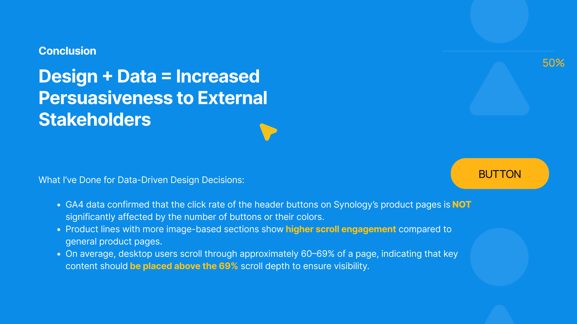
📢 Conclusion – From Metrics to Meaningful Design By combining design and data, we’re not just making things look good—we’re making them work better. This project helped our team build stronger arguments when communicating with external stakeholders. For example, we confirmed that the number or color of header buttons didn’t significantly affect clicks—so we shifted our focus to content clarity. We also learned that product pages with more visual elements led to deeper scroll behavior, which helped us prioritize image-based storytelling. And finally, we found that most desktop users scroll up to about 60–69% of the page—so now, we place the most important content above that line to ensure it gets seen. These insights helped turn our UX intuition into measurable, actionable strategy.
📢 Conclusion – From Metrics to Meaningful Design By combining design and data, we’re not just making things look good—we’re making them work better. This project helped our team build stronger arguments when communicating with external stakeholders. For example, we confirmed that the number or color of header buttons didn’t significantly affect clicks—so we shifted our focus to content clarity. We also learned that product pages with more visual elements led to deeper scroll behavior, which helped us prioritize image-based storytelling. And finally, we found that most desktop users scroll up to about 60–69% of the page—so now, we place the most important content above that line to ensure it gets seen. These insights helped turn our UX intuition into measurable, actionable strategy.
As a design coordinator, I often saw designers struggle to evaluate whether their work truly made an impact. Visuals looked great, but we lacked numbers to back our decisions. That’s why I created this GA4 tutorial—to bridge the gap between design and data, and help our team turn observations into insights.
Design isn’t just about how things look—it’s about how decisions are made. This project taught me that great UX stems from both data fluency and design intuition. By analyzing scroll behavior, click patterns, and engagement depth with GA4, I helped shape content strategies that speak to users—and stakeholders. It remains a defining example of how I bridge analytics and design to drive measurable UX impact.
Design isn’t just about how things look—it’s about how decisions are made. This project taught me that great UX stems from both data fluency and design intuition. By analyzing scroll behavior, click patterns, and engagement depth with GA4, I helped shape content strategies that speak to users—and stakeholders. It remains a defining example of how I bridge analytics and design to drive measurable UX impact.